Design a functional sleep tracker app using core UX/UI principles
This article takes you through my experience with app design. Detailing how the project started, my experience with it and the surprising transferable skills gained.
Key Summary
Make sure to really understand your user and what their specific needs are to the project
Use examples of good design that you've experienced, read up on the behavioural science to back up assumptions and make sure you're making the best design choices
Ideation techniques such as How might we statements and Crazy 8's are a great way of getting out of the box ideas without thinking you could be wrong (would be great to do with a team)
Think about continuity throughout the design, create components and brand guidelines as soon as possible as this will save you loads of work down the line.
Have fun with it. The quirkier and more human the design is the more memorable so follow your gut a little too and think of ways you can surprise, delight and inspire the user at different points of their journey. Give yourself permission to be bold and experiment!
How the project started
UX/UI design stands for user interface and user experience, this is essentially the look and feel of a product.
Think about when you go on to a website, how is that experience? UX/UI designers, in my opinion are the unsung heroes of many businesses.
I'm sure if I were to ask to think of a bad user experience you can name a fair few.
For me all I have to do is think of my time trying to navigate the UK's government website or Microsoft teams and my blood starts to boil.
But what makes it so frustrating, and how can we design to create a seamless user experience? One where everything just works.
This is what I aimed to learn.
My Experience
It was whilst watching a great Netflix series called Abstract:,The Art of design that I finally understood design and the many use cases it has.
After watching, I realised this was the umbrella term I'd been looking for which surmised my type of creativity.
I'm not a great drawer but I LOVE out of the box thinking and finding the best, most direct way to deliver information with the end user in mind, this is design!
It felt like a missing part of my identity had been found.
Knowing that I love to build online and I can see myself staying closely connected to tech/ startup space for the majority of my career
I decided to embark on a UX/UI course hosted by Bath Spa University to up-skill myself and also learn more about this subset of design.
I learned lots about the 5 stages of design thinking:
Stage 1: Empathise - Researching the users needs
Stage 2: Define - Stating the users needs and problems
Stage 3: Ideate- Challenge assumptions and create ideas
Stage 4: Prototype - Start to create solutions
Stage 5: Test - Try your solutions out
and how it can inform design processes and ways you can elaborate on it.
App design was something I'd never done before so was the perfect first challenge.
My approach
I wanted to combine the design thinking framework we were given with elements of agile project management to allow for plenty of feedback looks and checkpoints throughout the process to ensure an iterative process.
The Brief / exploratory phase
Research
Ideate
Prototype
Reflect
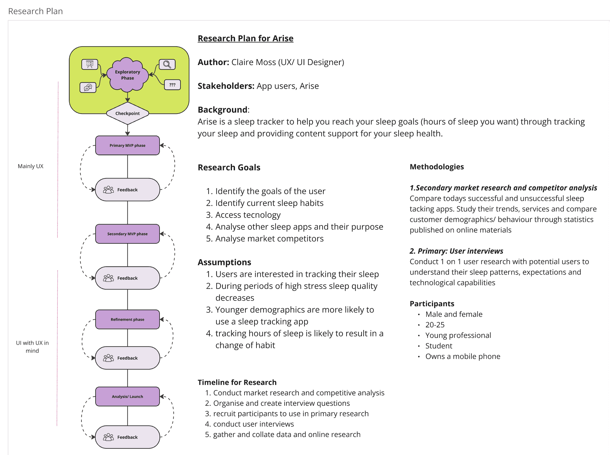
I created a research plan using the design tool Miro which formed the basis of my 8 week project.
Phase 1: The Brief
We were given a simple and fairly high level brief, I took out the core elements and surmised it below:
Create a prototype app for tracking sleep for Young professionals who find it hard to switch off and Students who are stressed during exams.
The app must be affordable, science backed and track the hours of sleep of the user.
Primary Research
Outlining the goals, assumptions and methodologies I would choose to conduct research.
Interviews
Primary research: I chose Interviews as qualitative research method to gather detailed responses and more nuanced data than a survey alone could provide.
My criteria interviewees was;
Male and female
20-25
Young professional
Student
Owns a mobile phone
After 15 interviews, a relatively small sample size but enough to give me insights to work with I had a better high level understanding of the sleep problems young adults were facing.
User Personas
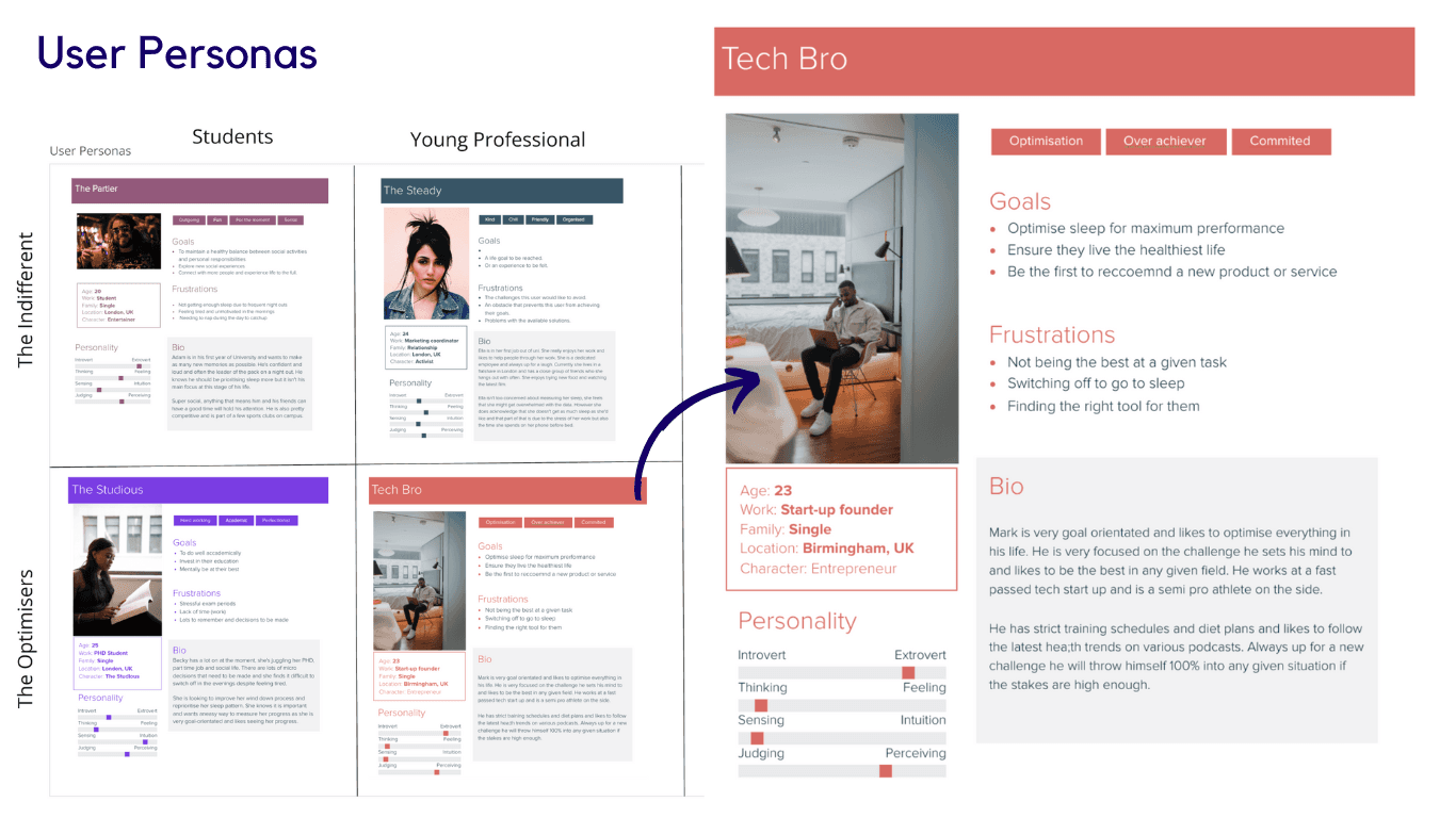
Using this initial interview I could better define the problem. Separating the type of potential users into 4 different User Personas.
I found that within the student and young professional group there seemed to be 2 camps.
The Indifferent: Those who knew there were things that would improve sleep but didn't really plan to prioritise them
Optimists, who regularly monitored their sleep and would actively do things to improve their chances of getting good night.
This helps as you use the amalgamation of each personality type to recognise core features/ behaviours that they likely have.
You make up people to represent each type so you can design with an end user in mind:
Empathy Mapping
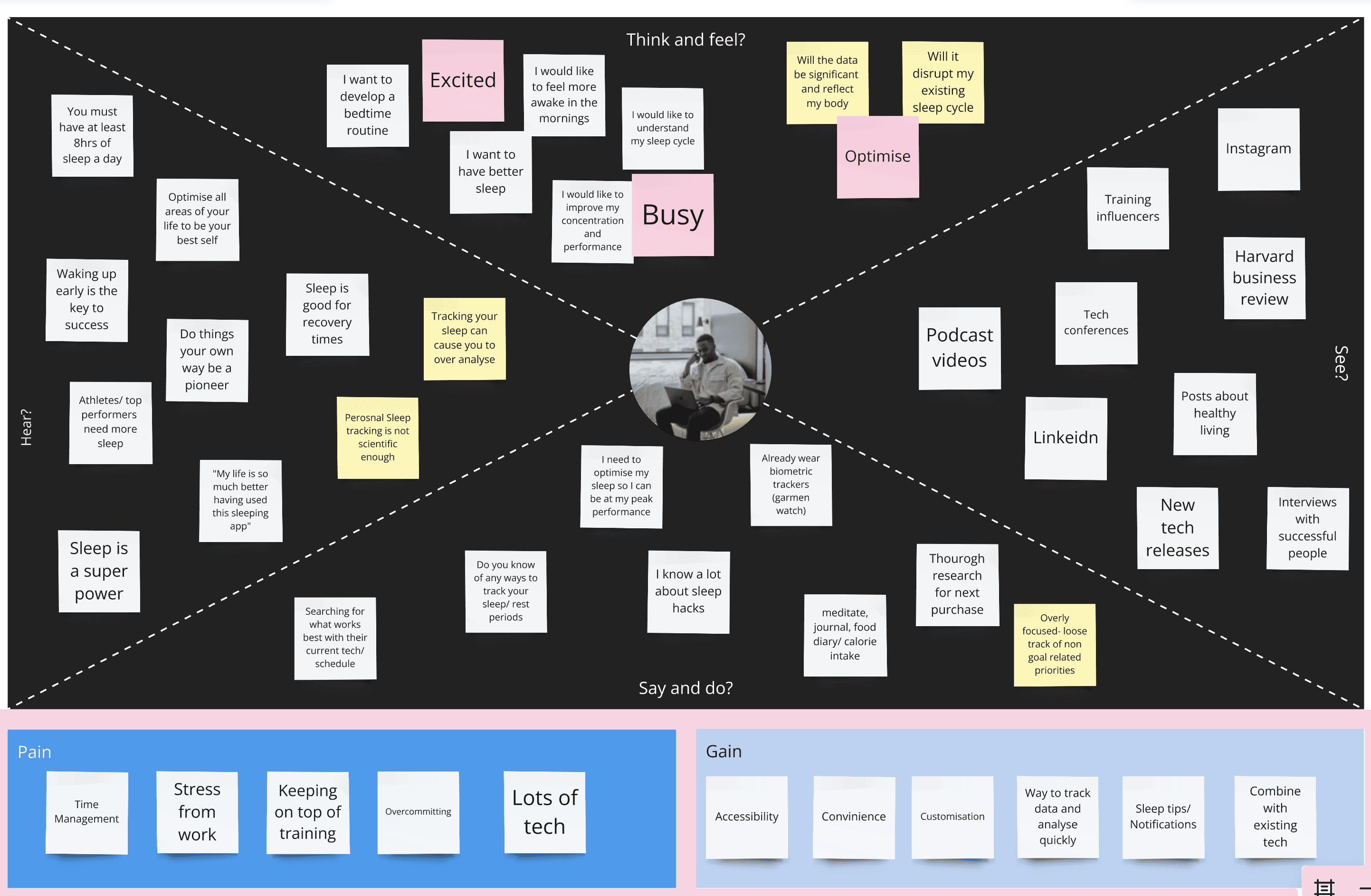
Using each of the 4 user personas I then created an Empathy map for each. This outlines what each of my made up personas might:
Think and feel
Hear
Say + do
See
This helps us to identify what their goals and biggest pain points might be.
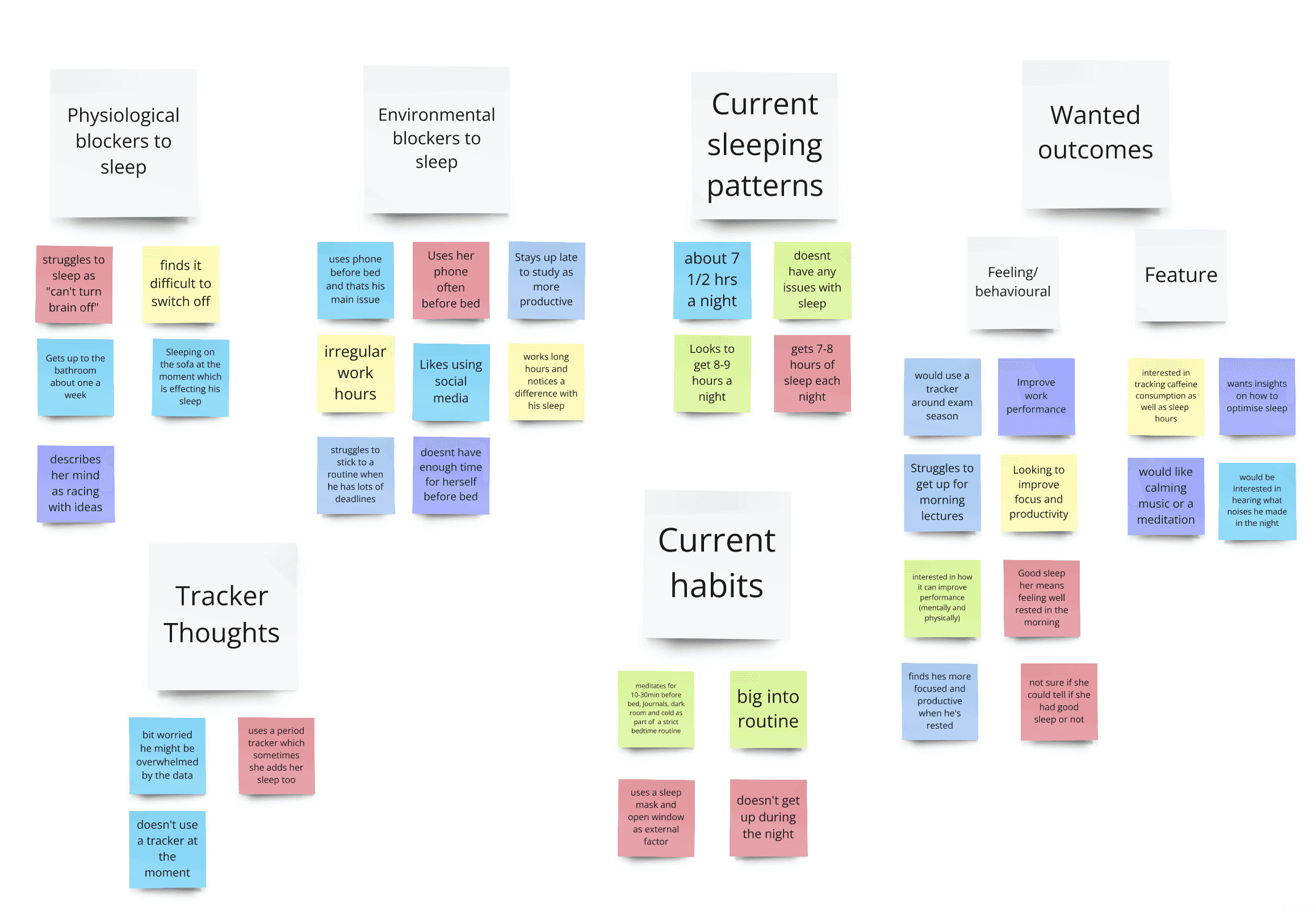
Affinity Mapping
Affinity mapping, I learned, is a technique used in across various fields, including medicine, data science, and marketing.
I used it here to identify and visualise relationships and similarities between different ideas given by my interviewees.
It allowed me to discover similarities and new patterns, allowing a better interpretation of my data and subsequent decision making within my project.
Scientific Research
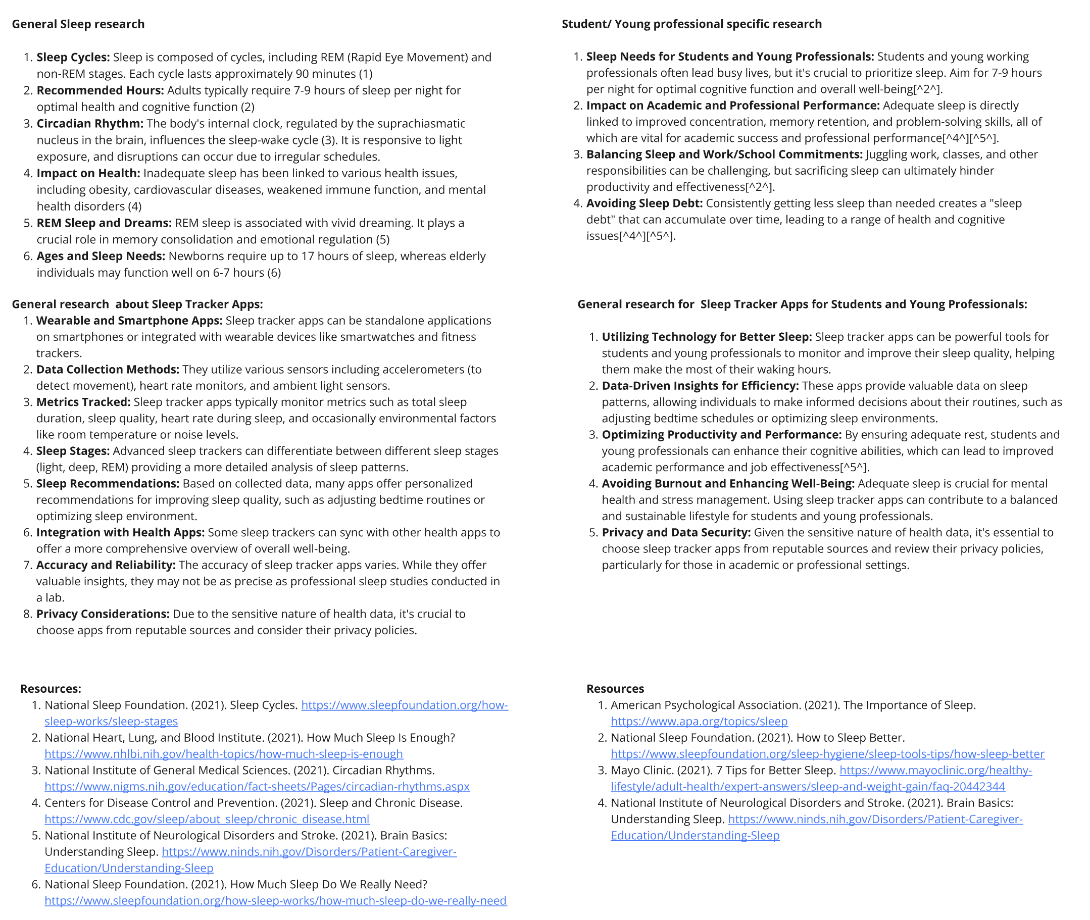
My research showed the different needs of sleep for each age group. I also found that sleep trackers didn't have much scientific evidence behind them with only 78% success rate with biological trackers. This lead me away from using them in my final product.
Ironically from my research, had i been working for a company, I would have recommended a non digital product, such as a phone safe.
My finding showed that tracking can cause worry and that simply looking at a phone just before bed can have negative effects. Therefore a phone safe that would keep the phone out of sight/ mind whilst in the bedroom would likely be the most effective solution.
However, for this hypothetical project the app would have to do!
Secondary Research: Competitor Analysis
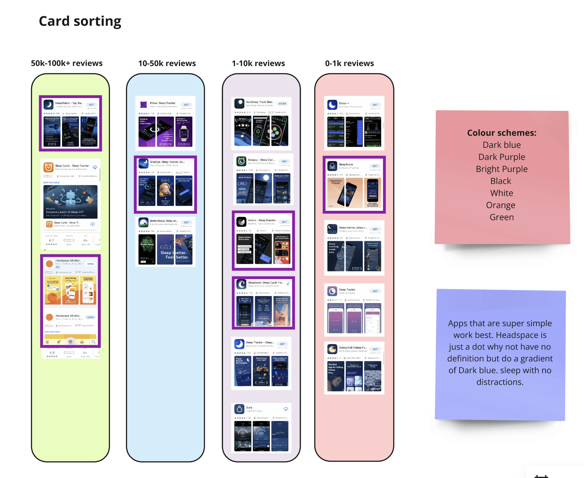
Card Sorting
Card sorting is a research method used to categorise and categorise concepts, ideas, or objects based on their characteristics, similarities, or relationships.
I used it to identify patterns between the most and leas popular sleep apps (as per apple app store downloads).
This allowed me to pick up on common themes,
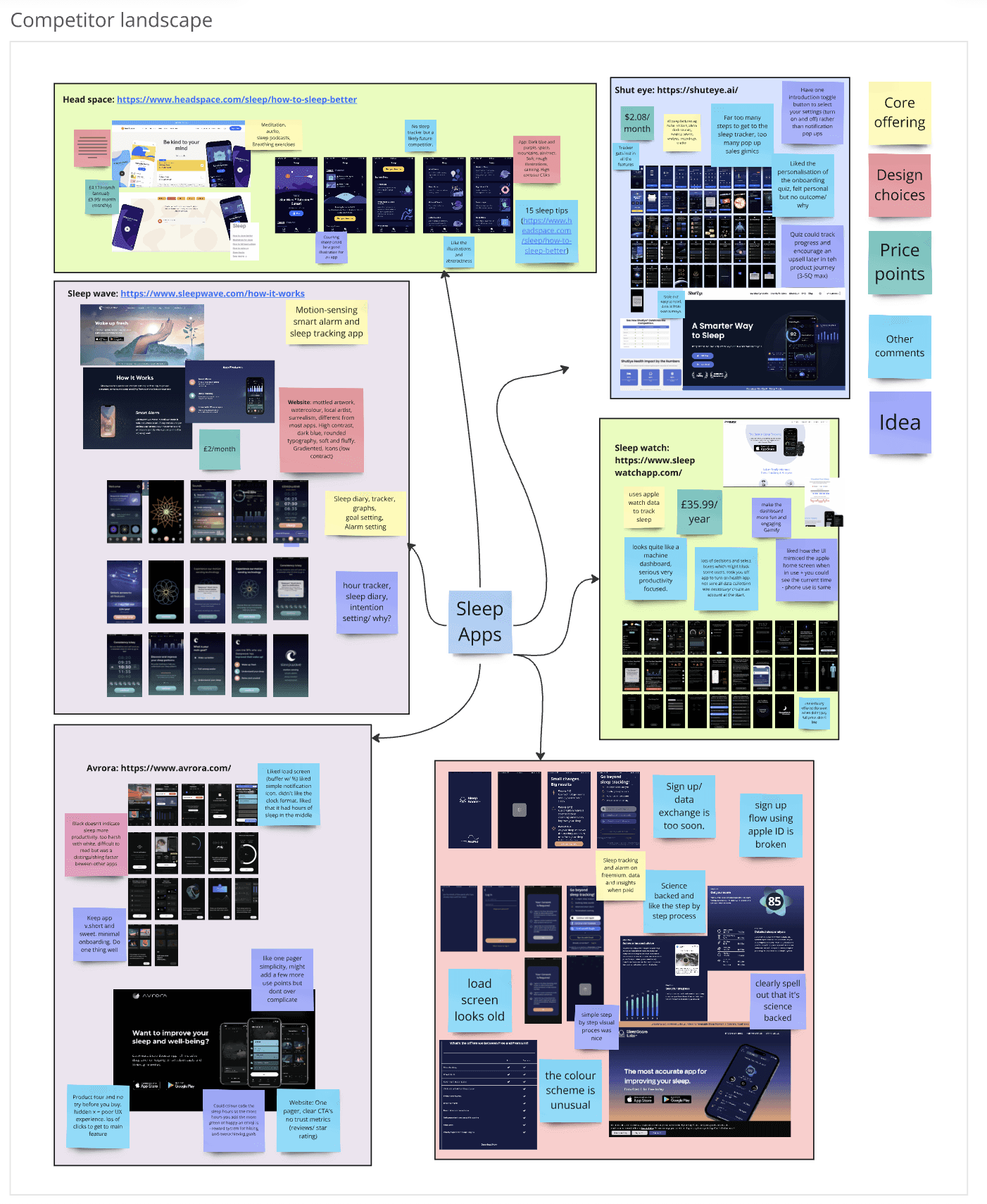
From here I expanded on that research to map out the competitor landscape, using the data from other similar apps and adjacent industries to draw insights.
This was particularly important for this project where we were on a tight timeframe and limited resources.
Larger more established companies would have likely put a lot of money behind A/B testing (a method used to compare slight differences in design, writing (copy) and general design features to help inform designers of what works best.
Competitor Landscape
Using the data set above I further expanded on it to better identify and scope out the competitor landscape, focusing in on more core areas such as:
The core offering
User flow
Design choices
Price points
Other comments - such as commonalities
Ideas - Ideas I had off seeing the competitor models
SWOT Analysis
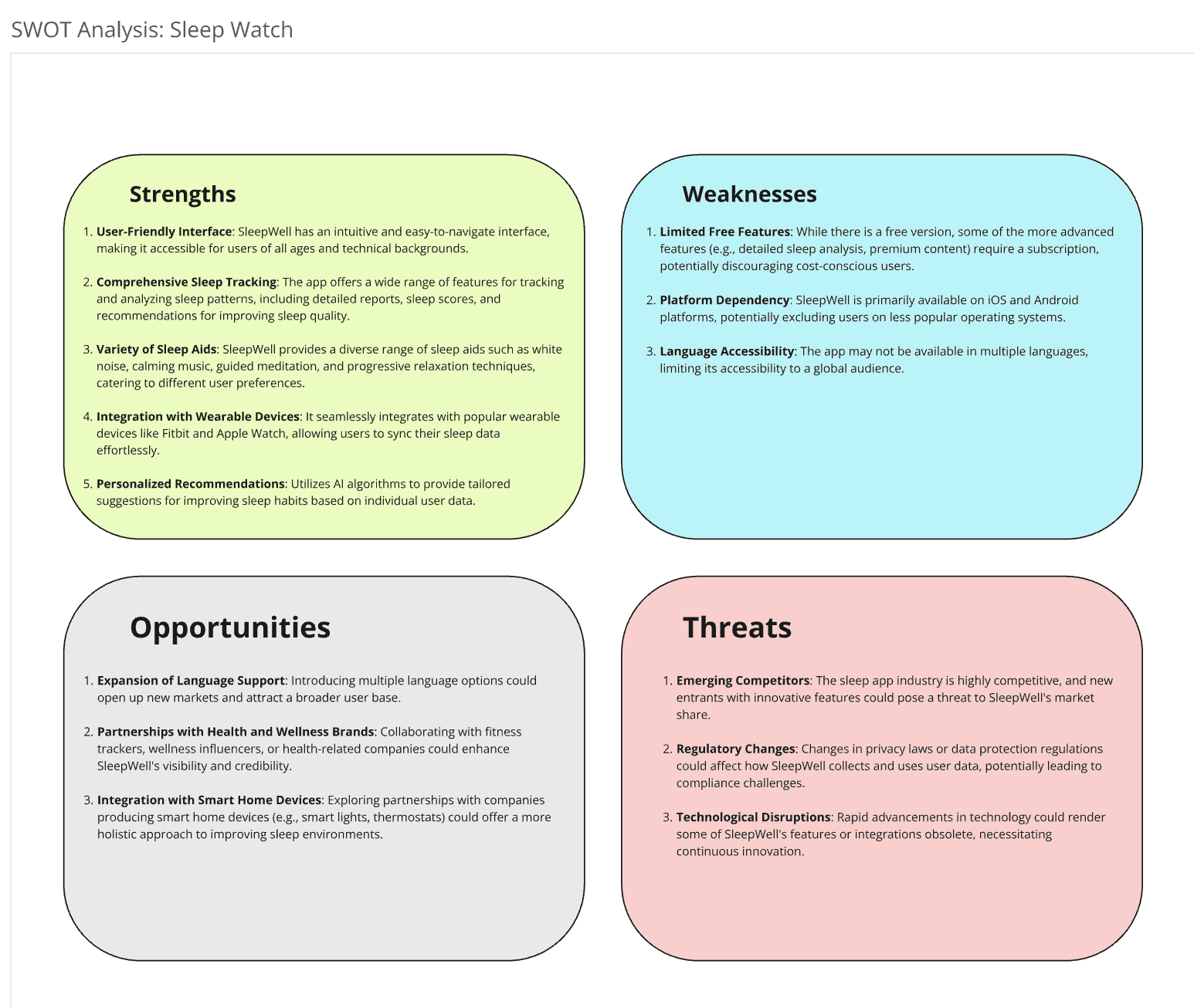
A SWOT analysis stands for, strengths, weaknesses, opportunities and threats. It looks at your closest competitors and identifies where you sit in the market and how you can differentiate yourself and fill a market need or gap. For this SWOT analysis I studied sleep watches.
My refined goals:
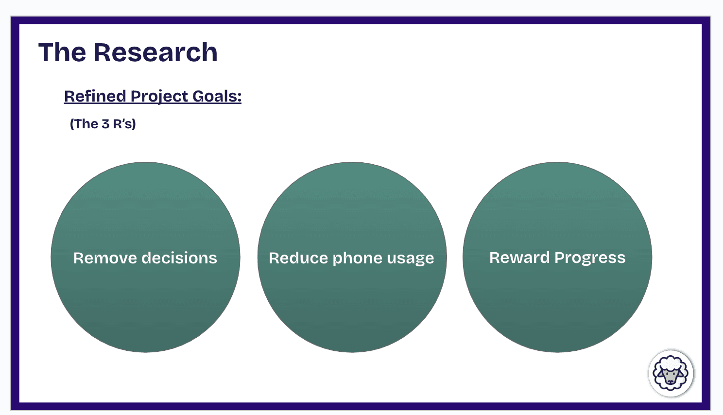
Using my research I refined and defined some secondary goals to enable users to use the app effectively.
Phase 3: Ideate
Crazy 8's
Crazy 8's are one of the most valuable techniques I learned.
To start you need a piece of paper which is folded into 8 sections (crazy I know). From there you set a question and 1 minute timer. For each section you have to draw a solution to your problem, no matter how unfeasible it might initially seem.
At the end of the 8 minutes you'll have some creative ideas which could potentially be further workshopped into actionable solutions.
I've since used this technique a lot to overcome creative blocks and even in more corporate work!
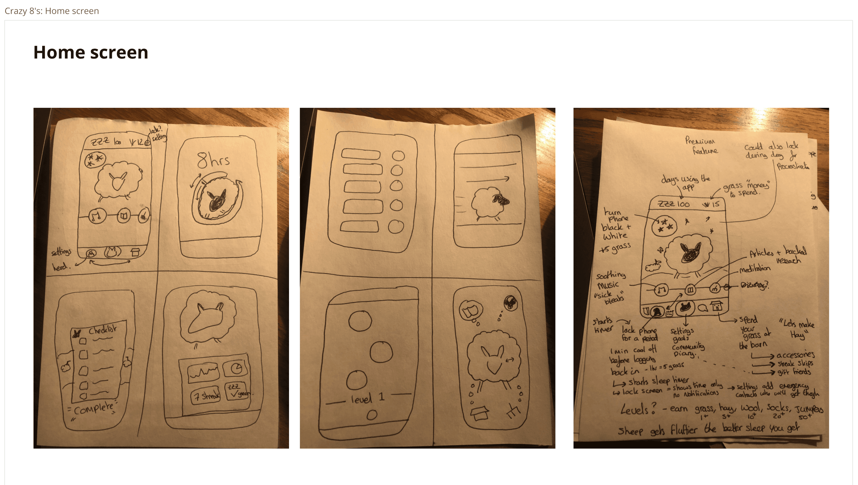
My crazy 8 for my home screen idea and further workshopped idea:
How might we statements
How might we questions are great.
Not only did I have to really define the problem I was trying to solve for, which is a great exercise in itself but it was also a great way to generate creative solutions without the risk of feeling that you need to fully solve it.
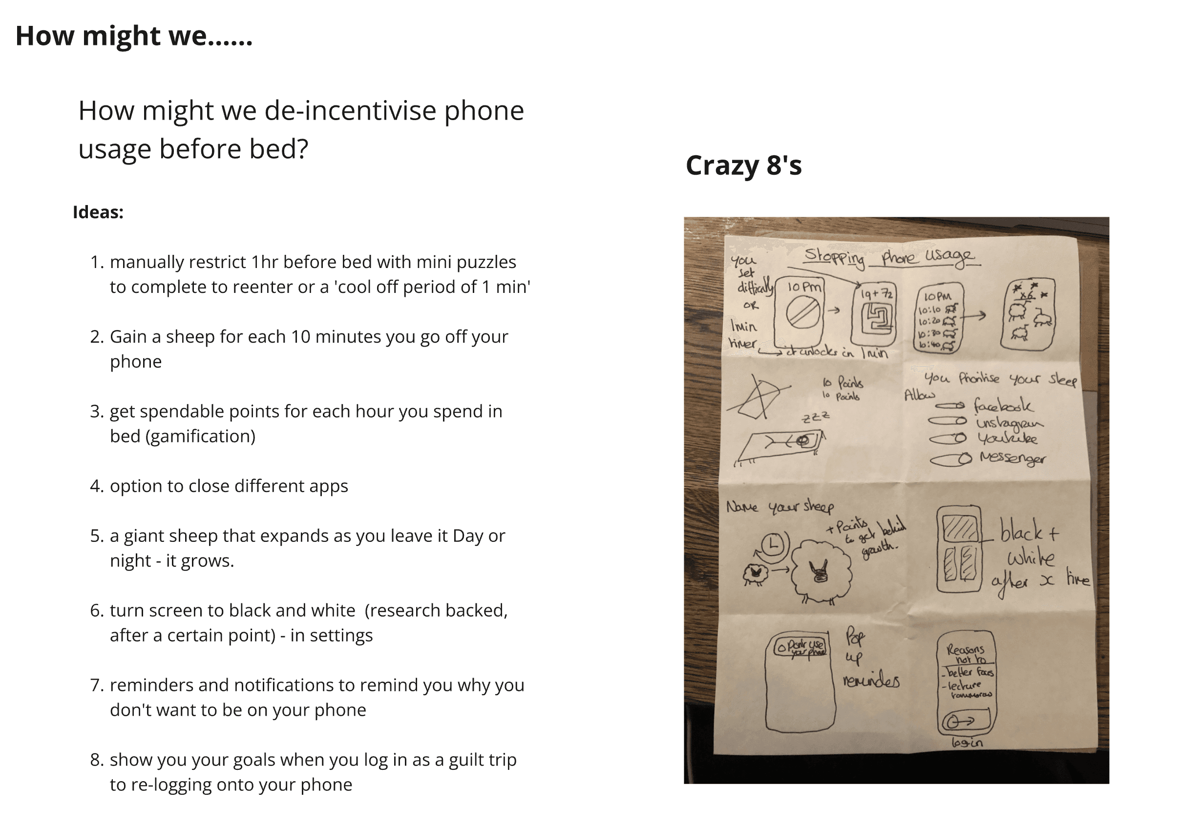
I decided to combine the How Might We statement exercise with my favourite UX/UI method so far, the crazy 8.
Phase 4: Prototype
From Ideation to my first Prototype. I used the design tool Figma to mock up the first looks
In UX/UI design there are many types of prototypes, relating to the detail and colour that goes into them. Below is my design process from:
Low fidelity on the left
High fidelity on the right
I had decided I wanted to use the gamification elements and design blueprint from the popular language learning app duo lingo.
I'd come up with a catchy marketing slogan that played off the expression of counting sheep to get to bed so decided that would be an apt main character for my sleep app.
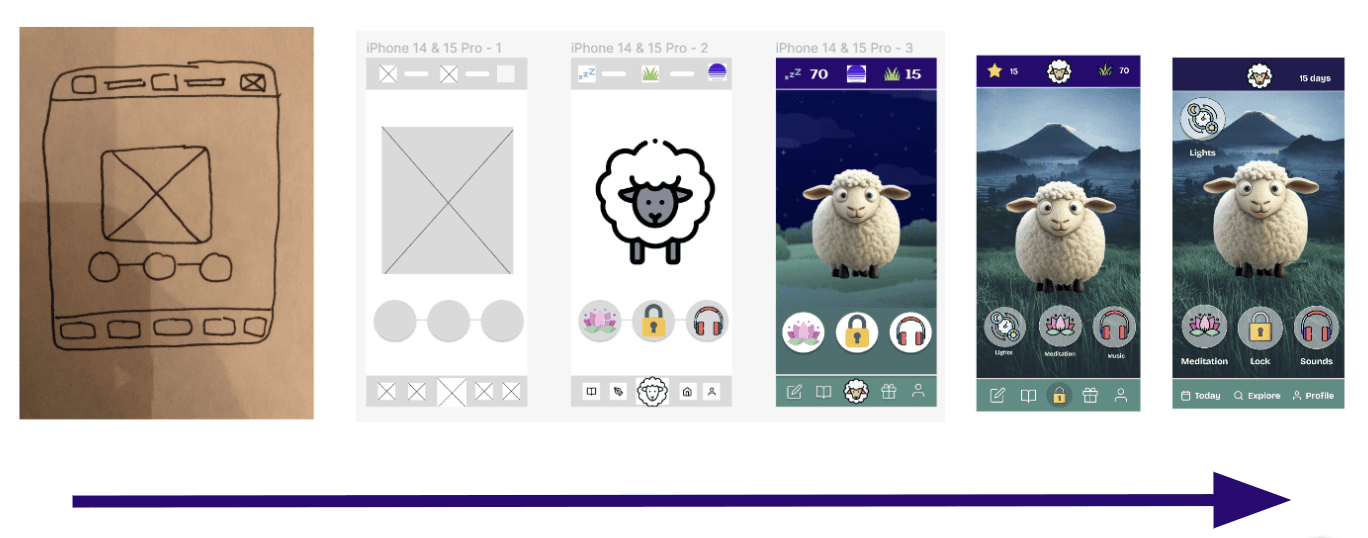
This makes the process look fairly straight forward however there were many unused ideas along the way.
Which for various reasons didn't fit my vision for the final app and worked against some of the constraints I'd set myself. Including
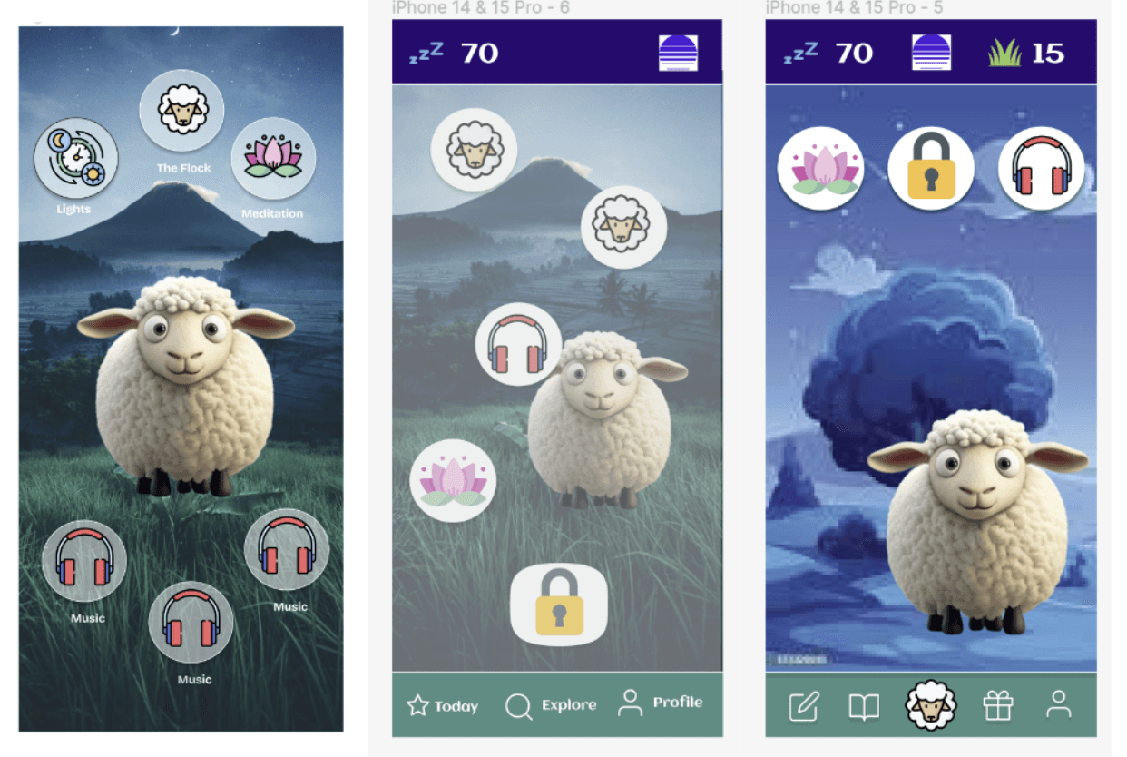
Various Design changes were made along the journey including:
Reducing the number of options on the bottom header (as per my 3 r's stated in my refined goals)
Semi transparent buttons to make it less contrasted with the background
More realistic and detailed cartoon sheep to engage the user
Simplified top header with a streak score and point system
More detailed background to give a wider world connection
Logo continuity with all icons having the same outline and colour pallet
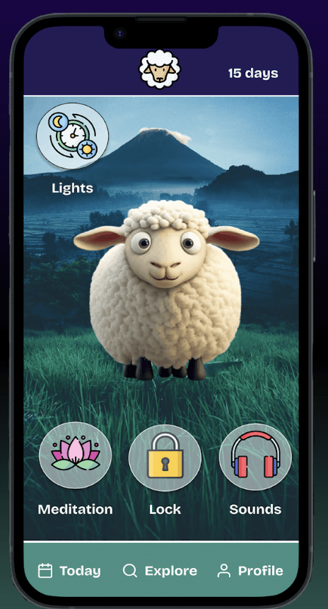
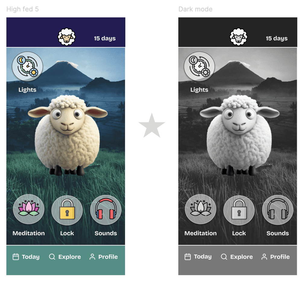
The final home screen
Phase 5: Brand Guidelines
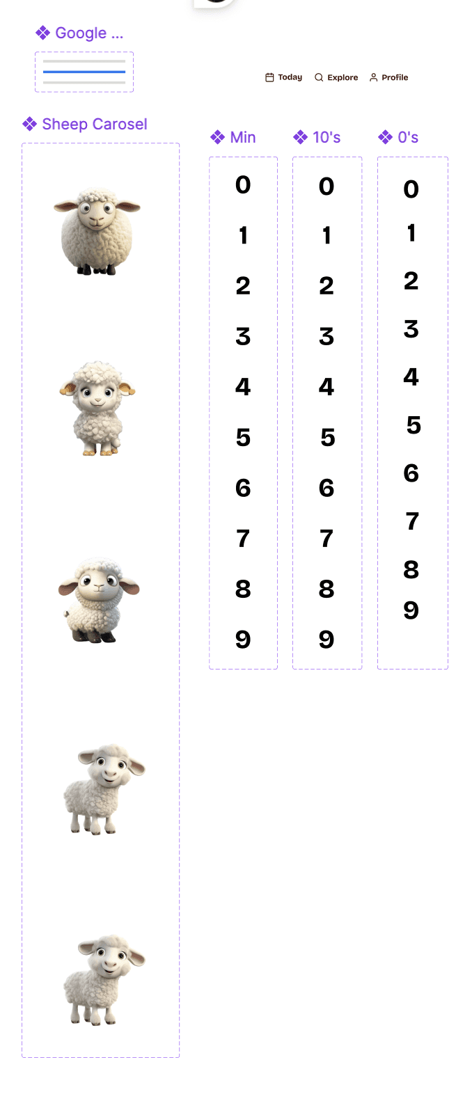
Components
In UX/UI design, a component refers to a reusable piece of code or visual element that can be used to build a user interface.
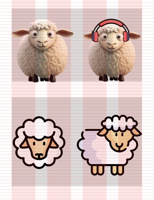
It's a self-contained unit with a specific function, such as a button, icon, or in this case sheep selection.
Designed to be modular, flexible, and easily customisable they are made in a component library and made to suit different needs and platforms.
This allows us to reuse and combine them to create cohesive and user-friendly interfaces.
They act almost as a master copy so rather which can save time ie. if we wanted square buttons not rounded we change the component and all other use cases are updated.
Imagery
When using a grid format you can see how far from the edge any given element of your deign is. Ideally you want to be well within the red sections
Colour Palette
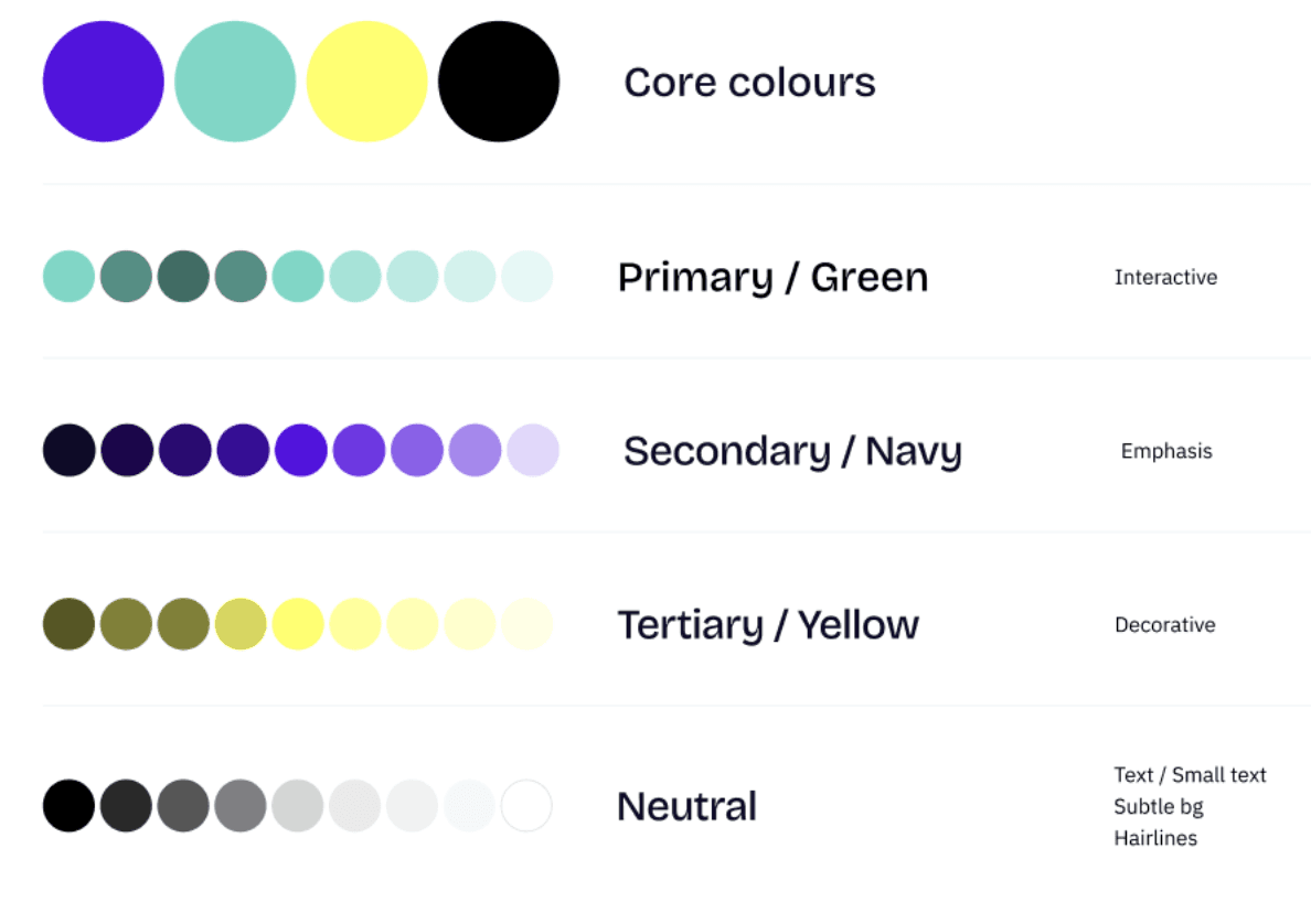
Colour ramps were used to indicate different functionalities of the app and maintain consistency of design.
Typography
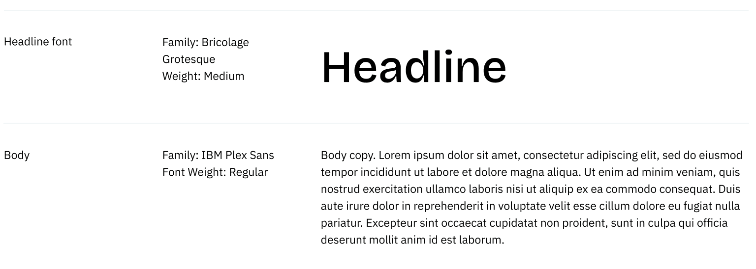
Typeface was also uniform, acting to maintain the consistency of the brand
Logo
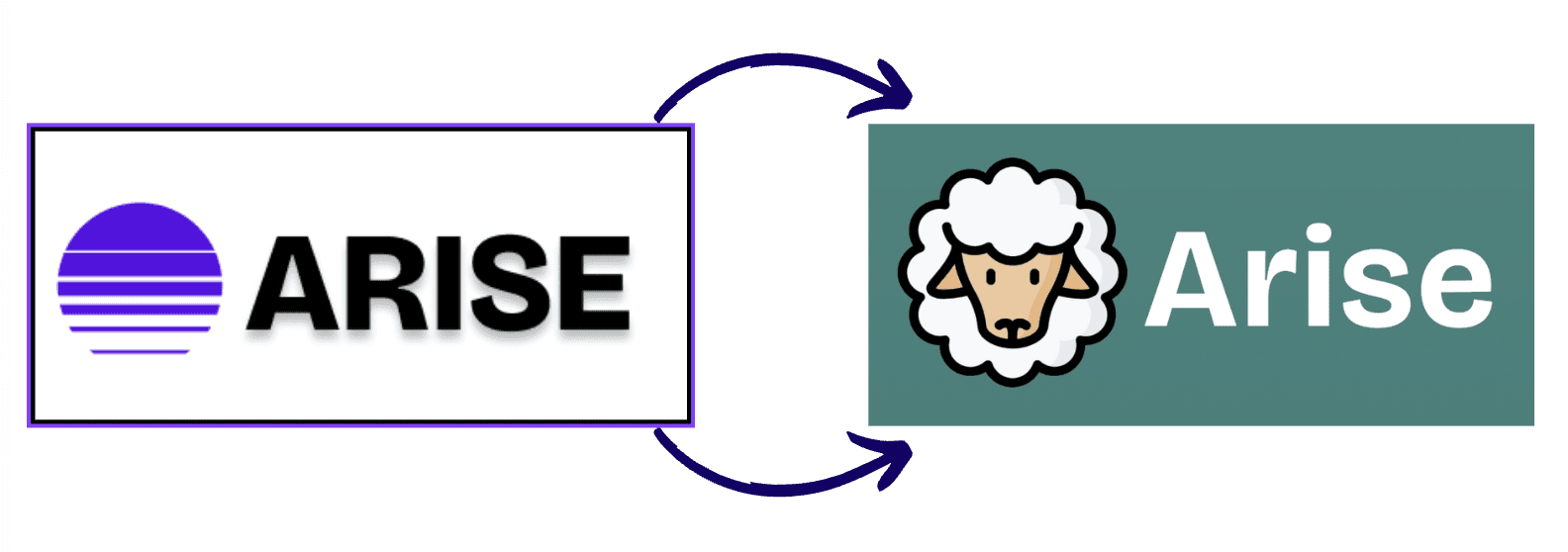
One thing I did insist on changing was the logo, I wanted something simple and more recognisable so I set out a framework to explain how my decision was made and submitted my new design during our end of course presentation
Phase 6: Build
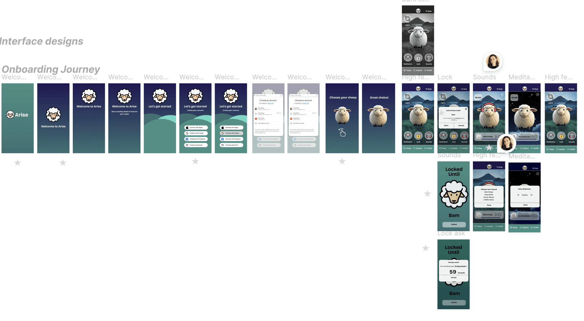
The build had a lot of moving components, I am a bit obsessed with smooth onboarding journeys as I believe a lot of companies get this wrong, causing a huge loss in potential customers and brand loyalists!
I really admire Headspace the meditation app, for their clean and engaging interface. So took inspiration from them.

Here I wanted personalisation features such as choosing your sheep icon from a swipe action and a quick and easy social log in to save having to fill out loads of forms.
Other apps often ask for payment upfront before seeing the product, from my own experiences and research this is a mistake as conversion drops off very fast.
You need to make sure the customer can see the real value they get from upgrading and not feel pressured into it.
I used the website growth design (linked below) to research tactics to encourage user engagement and the psychology behind design and would really recommend it as a resource!
The Final home screen design:

As you can see there are many features to the app. I built out active prototypes for each of the core buttons:
Lights (Night-mode)
Meditation
Lock
Sounds
Lights
Finding an icon which symbolised turning off the lights, without being a light switch was surprisingly difficult.
I added this feature off the back of my research. I found that having your phone on greyscale reduces your want to be on it by up to 20-50minutes per day.
Its actually a feature I use on my I-Phone and love so would suggest giving it a go! You might need to update the settings but when you triple tap your home button/ side button the whole screen will remain in grey scale.
Meditation
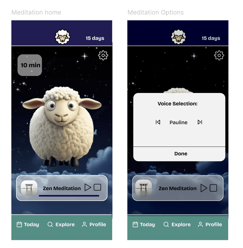
For the meditation app I wanted to stick to my commitment of as fewer options as possible to avoid cognitive overload (when you have to make too many decisions.
Here you can set a time and when you tap on the top left button change the duration.
When you click on settings you can change your voice selection.
from there you can press start or stop. no other choices so it pushes you toward action.
Lock
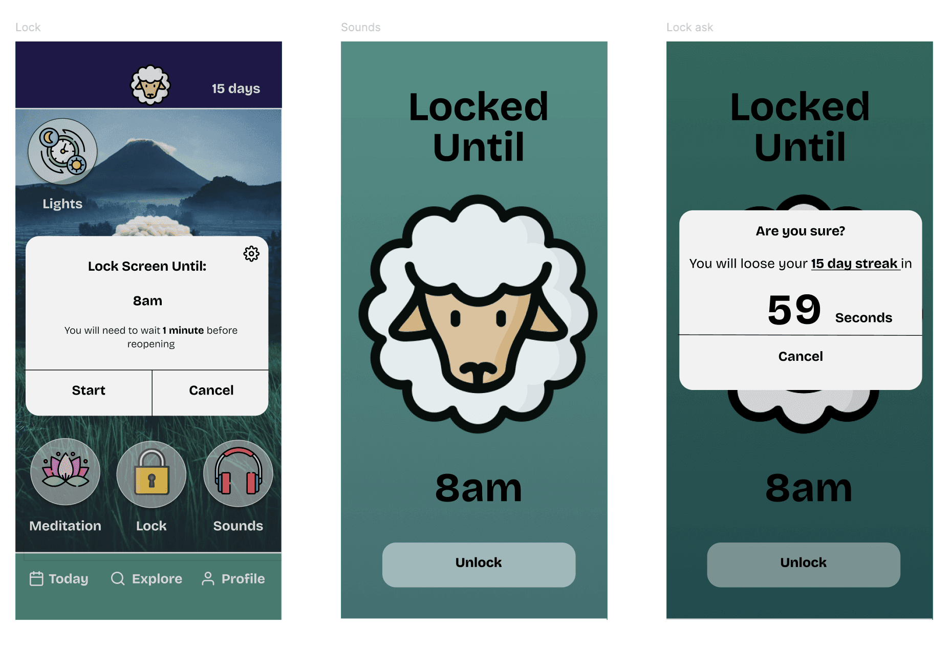
Lock is actually my favourite feature that I added as it uses a few psychological tricks to try and help you stick to your goal.
First you decide how long you want to lock your phone for, it's easy to change the default time in the settings and if an emergency contact rings it will override the apps lock screen.
Then the simple logo screen will show, reminding you of the commitment you made, increasing brand awareness and hopefully acting as a deterrent to overriding the action.
If you did click unlock then a countdown timer set to 1min would appear. This "cool off period" should help reduce the immediate dopamine rush that deciding to log on to your phone to check social media, so will hopefully change the users behaviour.
However knowing they can access their phones functionality in case of emergency should encourage them to stick with using the app long term.
Sounds
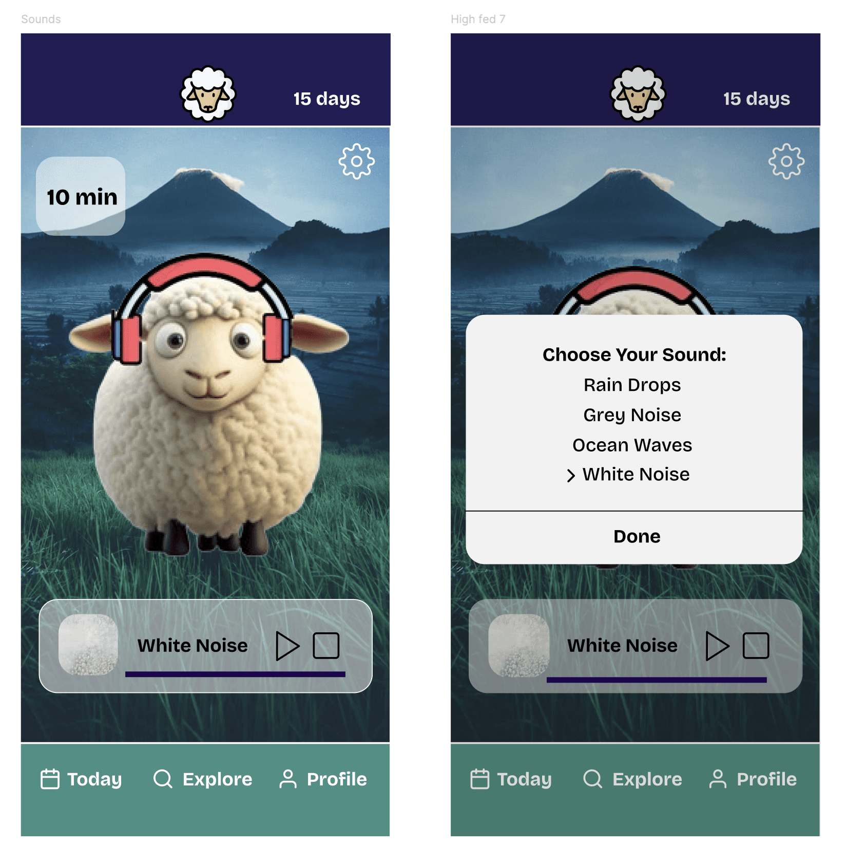
Sleep sounds such as waves or raindrops can be chosen here. The sheep gains earphones and the background is slightly darkened when the pop up appears to ensure the focus is on the one decision that needs to be made.
User journey
Overall I wanted to keep the user journey fairly simple and easy to understand. You can play around with the working prototype here. Do feel free to give any feedback I'd love to know what you think!
If there's any budding app developers who want to use the design do also reach out I'd be more than happy to chat haha
Branding
Finally I can bring all of it together with a quick pitch deck highlighting some of my process and a final promo slide that I could see being a good billboard AD (see below).
Clean, crisp and clear branding with a clear theme throughout.
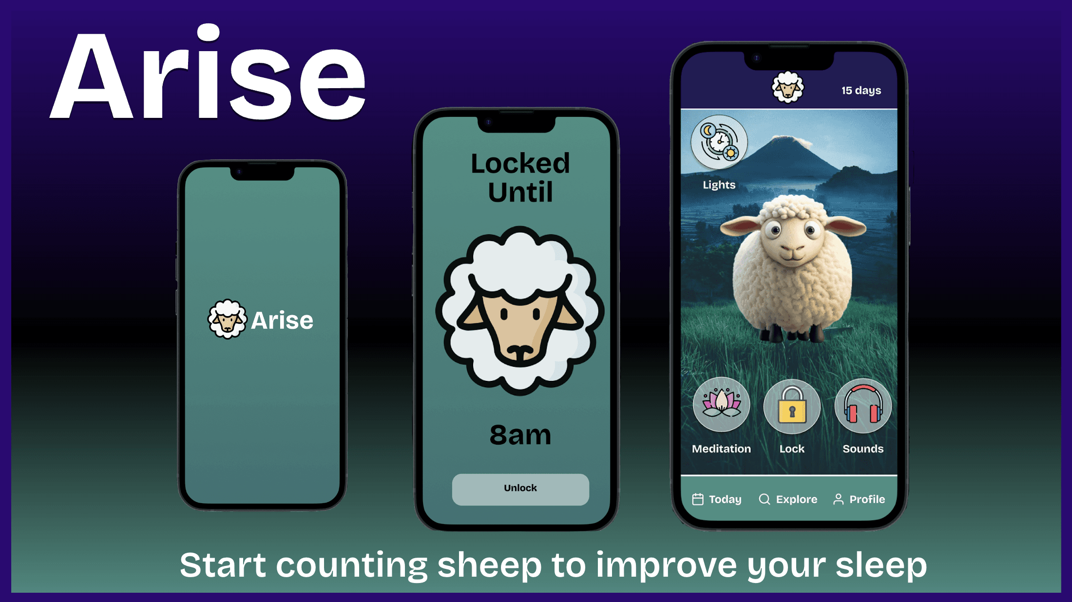
The brand slogan of Start counting sheep to improve your sleep was also something that I really thought tied the whole project together and was really the basis of my design.
Phase 7: Reflections + next steps
There's a few minor design changes I'd like to change, such as:
having a navy blue background on the lock screen to reflect the night sky.
Fix the bugs that have come up on my working prototype version of the countdown timer. Which was triggered by a Figma has update
Create a 'The Flock' community page for people to connect
Design a diary page to show what days your streak was maintained
Explore gamification, is there a way you could win woolly socks for completing certain milestones
Further animation and personalisation of the sheep upon sign in
Notification and out of app prompts/ widgets to remind you to slow down and begin to think about sleep.
Annndd maybe building it and marketing it out one day….. (please do get in touch if you'd like to help with this!)
Overall I really enjoyed this project, both from the user experience (UX) element of thinking of how best we can define and solve for the problem, all the way through to the user interface elements of deciding on brand colours, button components and logos.
In a completely unexpected twist Bath Spa even posted an article about my designs on their website which made me doubly proud of how it turned out!
Resources
No affiliate links just useful free resources for those looking to get started!
Inspiration
Special Thanks to:
Kevin Brown: My UX/UI tutor during Bath Spas bootcamp, he really helped my understand the concepts and was very generous with his time outside of the course
All of the UX/UI girls!: We still meet for the odd coffee morning and they are genuinely up there with some of the most talented UX/UI designers I have seen, if you'd like some UX/UI work done then please do let me know I'd be more than happy to send over their portfolios
Random person on Linkedin: (unfortunately, I can't remember who) but you posted about the free bootcamps for those looking to up-skill and without seeing your post this journey wouldn't have started
Josh: From Catch22, a careers coaching platform you get alongside the course, you've helped me more than you know and I really appreciate your time and insights.
Design a functional sleep tracker app using core UX/UI principles
This article takes you through my experience with app design. Detailing how the project started, my experience with it and the surprising transferable skills gained.
Key Summary
Make sure to really understand your user and what their specific needs are to the project
Use examples of good design that you've experienced, read up on the behavioural science to back up assumptions and make sure you're making the best design choices
Ideation techniques such as How might we statements and Crazy 8's are a great way of getting out of the box ideas without thinking you could be wrong (would be great to do with a team)
Think about continuity throughout the design, create components and brand guidelines as soon as possible as this will save you loads of work down the line.
Have fun with it. The quirkier and more human the design is the more memorable so follow your gut a little too and think of ways you can surprise, delight and inspire the user at different points of their journey. Give yourself permission to be bold and experiment!
How the project started
UX/UI design stands for user interface and user experience, this is essentially the look and feel of a product.
Think about when you go on to a website, how is that experience? UX/UI designers, in my opinion are the unsung heroes of many businesses.
I'm sure if I were to ask to think of a bad user experience you can name a fair few.
For me all I have to do is think of my time trying to navigate the UK's government website or Microsoft teams and my blood starts to boil.
But what makes it so frustrating, and how can we design to create a seamless user experience? One where everything just works.
This is what I aimed to learn.
My Experience
It was whilst watching a great Netflix series called Abstract:,The Art of design that I finally understood design and the many use cases it has.
After watching, I realised this was the umbrella term I'd been looking for which surmised my type of creativity.
I'm not a great drawer but I LOVE out of the box thinking and finding the best, most direct way to deliver information with the end user in mind, this is design!
It felt like a missing part of my identity had been found.
Knowing that I love to build online and I can see myself staying closely connected to tech/ startup space for the majority of my career
I decided to embark on a UX/UI course hosted by Bath Spa University to up-skill myself and also learn more about this subset of design.
I learned lots about the 5 stages of design thinking:
Stage 1: Empathise - Researching the users needs
Stage 2: Define - Stating the users needs and problems
Stage 3: Ideate- Challenge assumptions and create ideas
Stage 4: Prototype - Start to create solutions
Stage 5: Test - Try your solutions out
and how it can inform design processes and ways you can elaborate on it.
App design was something I'd never done before so was the perfect first challenge.
My approach
I wanted to combine the design thinking framework we were given with elements of agile project management to allow for plenty of feedback looks and checkpoints throughout the process to ensure an iterative process.
The Brief / exploratory phase
Research
Ideate
Prototype
Reflect
I created a research plan using the design tool Miro which formed the basis of my 8 week project.

Phase 1: The Brief
We were given a simple and fairly high level brief, I took out the core elements and surmised it below:
Create a prototype app for tracking sleep for Young professionals who find it hard to switch off and Students who are stressed during exams.
The app must be affordable, science backed and track the hours of sleep of the user.
Primary Research
Outlining the goals, assumptions and methodologies I would choose to conduct research.
Interviews
Primary research: I chose Interviews as qualitative research method to gather detailed responses and more nuanced data than a survey alone could provide.
My criteria interviewees was;
Male and female
20-25
Young professional
Student
Owns a mobile phone
After 15 interviews, a relatively small sample size but enough to give me insights to work with I had a better high level understanding of the sleep problems young adults were facing.
User Personas
Using this initial interview I could better define the problem. Separating the type of potential users into 4 different User Personas.
I found that within the student and young professional group there seemed to be 2 camps.
The Indifferent: Those who knew there were things that would improve sleep but didn't really plan to prioritise them
Optimists, who regularly monitored their sleep and would actively do things to improve their chances of getting good night.
This helps as you use the amalgamation of each personality type to recognise core features/ behaviours that they likely have.
You make up people to represent each type so you can design with an end user in mind:

Empathy Mapping
Using each of the 4 user personas I then created an Empathy map for each. This outlines what each of my made up personas might:
Think and feel
Hear
Say + do
See
This helps us to identify what their goals and biggest pain points might be.

Affinity Mapping
Affinity mapping, I learned, is a technique used in across various fields, including medicine, data science, and marketing.
I used it here to identify and visualise relationships and similarities between different ideas given by my interviewees.
It allowed me to discover similarities and new patterns, allowing a better interpretation of my data and subsequent decision making within my project.

Scientific Research
My research showed the different needs of sleep for each age group. I also found that sleep trackers didn't have much scientific evidence behind them with only 78% success rate with biological trackers. This lead me away from using them in my final product.
Ironically from my research, had i been working for a company, I would have recommended a non digital product, such as a phone safe.
My finding showed that tracking can cause worry and that simply looking at a phone just before bed can have negative effects. Therefore a phone safe that would keep the phone out of sight/ mind whilst in the bedroom would likely be the most effective solution.
However, for this hypothetical project the app would have to do!

Secondary Research: Competitor Analysis
Card Sorting
Card sorting is a research method used to categorise and categorise concepts, ideas, or objects based on their characteristics, similarities, or relationships.
I used it to identify patterns between the most and leas popular sleep apps (as per apple app store downloads).
This allowed me to pick up on common themes,

From here I expanded on that research to map out the competitor landscape, using the data from other similar apps and adjacent industries to draw insights.
This was particularly important for this project where we were on a tight timeframe and limited resources.
Larger more established companies would have likely put a lot of money behind A/B testing (a method used to compare slight differences in design, writing (copy) and general design features to help inform designers of what works best.
Competitor Landscape
Using the data set above I further expanded on it to better identify and scope out the competitor landscape, focusing in on more core areas such as:
The core offering
User flow
Design choices
Price points
Other comments - such as commonalities
Ideas - Ideas I had off seeing the competitor models

SWOT Analysis
A SWOT analysis stands for, strengths, weaknesses, opportunities and threats. It looks at your closest competitors and identifies where you sit in the market and how you can differentiate yourself and fill a market need or gap. For this SWOT analysis I studied sleep watches.

My refined goals:
Using my research I refined and defined some secondary goals to enable users to use the app effectively.

Phase 3: Ideate
Crazy 8's
Crazy 8's are one of the most valuable techniques I learned.
To start you need a piece of paper which is folded into 8 sections (crazy I know). From there you set a question and 1 minute timer. For each section you have to draw a solution to your problem, no matter how unfeasible it might initially seem.
At the end of the 8 minutes you'll have some creative ideas which could potentially be further workshopped into actionable solutions.
I've since used this technique a lot to overcome creative blocks and even in more corporate work!
My crazy 8 for my home screen idea and further workshopped idea:

How might we statements
How might we questions are great.
Not only did I have to really define the problem I was trying to solve for, which is a great exercise in itself but it was also a great way to generate creative solutions without the risk of feeling that you need to fully solve it.
I decided to combine the How Might We statement exercise with my favourite UX/UI method so far, the crazy 8.

Phase 4: Prototype
From Ideation to my first Prototype. I used the design tool Figma to mock up the first looks
In UX/UI design there are many types of prototypes, relating to the detail and colour that goes into them. Below is my design process from:
Low fidelity on the left
High fidelity on the right
I had decided I wanted to use the gamification elements and design blueprint from the popular language learning app duo lingo.
I'd come up with a catchy marketing slogan that played off the expression of counting sheep to get to bed so decided that would be an apt main character for my sleep app.

This makes the process look fairly straight forward however there were many unused ideas along the way.
Which for various reasons didn't fit my vision for the final app and worked against some of the constraints I'd set myself. Including

Various Design changes were made along the journey including:
Reducing the number of options on the bottom header (as per my 3 r's stated in my refined goals)
Semi transparent buttons to make it less contrasted with the background
More realistic and detailed cartoon sheep to engage the user
Simplified top header with a streak score and point system
More detailed background to give a wider world connection
Logo continuity with all icons having the same outline and colour pallet
The final home screen

Phase 5: Brand Guidelines
Components
In UX/UI design, a component refers to a reusable piece of code or visual element that can be used to build a user interface.
It's a self-contained unit with a specific function, such as a button, icon, or in this case sheep selection.
Designed to be modular, flexible, and easily customisable they are made in a component library and made to suit different needs and platforms.
This allows us to reuse and combine them to create cohesive and user-friendly interfaces.
They act almost as a master copy so rather which can save time ie. if we wanted square buttons not rounded we change the component and all other use cases are updated.

Imagery
When using a grid format you can see how far from the edge any given element of your deign is. Ideally you want to be well within the red sections

Colour Palette
Colour ramps were used to indicate different functionalities of the app and maintain consistency of design.

Typography
Typeface was also uniform, acting to maintain the consistency of the brand

Logo
One thing I did insist on changing was the logo, I wanted something simple and more recognisable so I set out a framework to explain how my decision was made and submitted my new design during our end of course presentation

Phase 6: Build
The build had a lot of moving components, I am a bit obsessed with smooth onboarding journeys as I believe a lot of companies get this wrong, causing a huge loss in potential customers and brand loyalists!
I really admire Headspace the meditation app, for their clean and engaging interface. So took inspiration from them.

Here I wanted personalisation features such as choosing your sheep icon from a swipe action and a quick and easy social log in to save having to fill out loads of forms.
Other apps often ask for payment upfront before seeing the product, from my own experiences and research this is a mistake as conversion drops off very fast.
You need to make sure the customer can see the real value they get from upgrading and not feel pressured into it.
I used the website growth design (linked below) to research tactics to encourage user engagement and the psychology behind design and would really recommend it as a resource!
The Final home screen design:

As you can see there are many features to the app. I built out active prototypes for each of the core buttons:
Lights (Night-mode)
Meditation
Lock
Sounds
Lights
Finding an icon which symbolised turning off the lights, without being a light switch was surprisingly difficult.
I added this feature off the back of my research. I found that having your phone on greyscale reduces your want to be on it by up to 20-50minutes per day.
Its actually a feature I use on my I-Phone and love so would suggest giving it a go! You might need to update the settings but when you triple tap your home button/ side button the whole screen will remain in grey scale.

Meditation
For the meditation app I wanted to stick to my commitment of as fewer options as possible to avoid cognitive overload (when you have to make too many decisions.
Here you can set a time and when you tap on the top left button change the duration.
When you click on settings you can change your voice selection.
from there you can press start or stop. no other choices so it pushes you toward action.

Lock
Lock is actually my favourite feature that I added as it uses a few psychological tricks to try and help you stick to your goal.
First you decide how long you want to lock your phone for, it's easy to change the default time in the settings and if an emergency contact rings it will override the apps lock screen.
Then the simple logo screen will show, reminding you of the commitment you made, increasing brand awareness and hopefully acting as a deterrent to overriding the action.
If you did click unlock then a countdown timer set to 1min would appear. This "cool off period" should help reduce the immediate dopamine rush that deciding to log on to your phone to check social media, so will hopefully change the users behaviour.
However knowing they can access their phones functionality in case of emergency should encourage them to stick with using the app long term.

Sounds
Sleep sounds such as waves or raindrops can be chosen here. The sheep gains earphones and the background is slightly darkened when the pop up appears to ensure the focus is on the one decision that needs to be made.

User journey
Overall I wanted to keep the user journey fairly simple and easy to understand. You can play around with the working prototype here. Do feel free to give any feedback I'd love to know what you think!
If there's any budding app developers who want to use the design do also reach out I'd be more than happy to chat haha

Branding
Finally I can bring all of it together with a quick pitch deck highlighting some of my process and a final promo slide that I could see being a good billboard AD (see below).
Clean, crisp and clear branding with a clear theme throughout.

The brand slogan of Start counting sheep to improve your sleep was also something that I really thought tied the whole project together and was really the basis of my design.
Phase 7: Reflections + next steps
There's a few minor design changes I'd like to change, such as:
having a navy blue background on the lock screen to reflect the night sky.
Fix the bugs that have come up on my working prototype version of the countdown timer. Which was triggered by a Figma has update
Create a 'The Flock' community page for people to connect
Design a diary page to show what days your streak was maintained
Explore gamification, is there a way you could win woolly socks for completing certain milestones
Further animation and personalisation of the sheep upon sign in
Notification and out of app prompts/ widgets to remind you to slow down and begin to think about sleep.
Annndd maybe building it and marketing it out one day….. (please do get in touch if you'd like to help with this!)
Overall I really enjoyed this project, both from the user experience (UX) element of thinking of how best we can define and solve for the problem, all the way through to the user interface elements of deciding on brand colours, button components and logos.
In a completely unexpected twist Bath Spa even posted an article about my designs on their website which made me doubly proud of how it turned out!
Resources
No affiliate links just useful free resources for those looking to get started!
Inspiration
Special Thanks to:
Kevin Brown: My UX/UI tutor during Bath Spas bootcamp, he really helped my understand the concepts and was very generous with his time outside of the course
All of the UX/UI girls!: We still meet for the odd coffee morning and they are genuinely up there with some of the most talented UX/UI designers I have seen, if you'd like some UX/UI work done then please do let me know I'd be more than happy to send over their portfolios
Random person on Linkedin: (unfortunately, I can't remember who) but you posted about the free bootcamps for those looking to up-skill and without seeing your post this journey wouldn't have started
Josh: From Catch22, a careers coaching platform you get alongside the course, you've helped me more than you know and I really appreciate your time and insights.
Join the Newsletter
Where curiosity meets action!
Each month, you'll receive the latest projects, insights, and resources to empower you to embark on your own learning adventure.
